
Details.
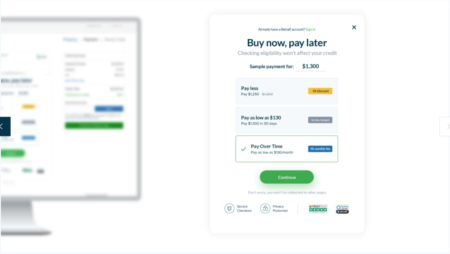
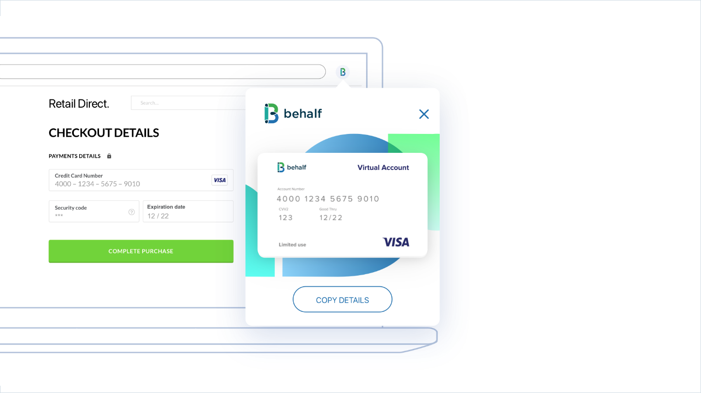
Behalf develops an innovative B2B lending solution. We where commissioned to completely re-define and re-design all of the company’s customer-facing assets, including the portal, embedded app, and the company’s website.
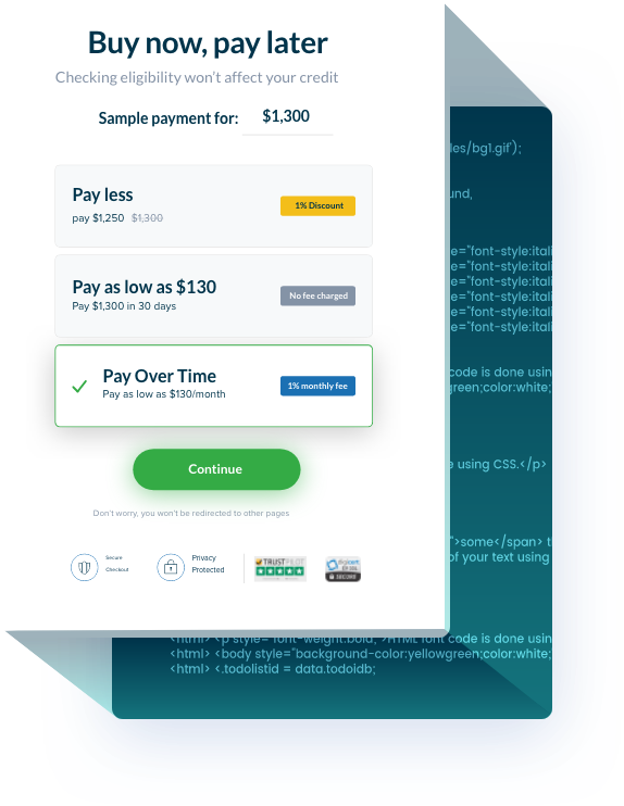
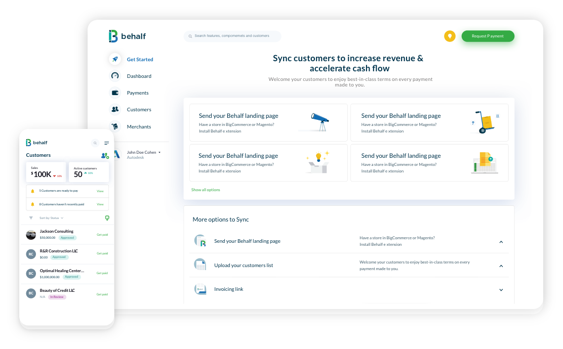
Behalf is a digital platform that radically improves cash flow for both the acceptor and the payor.
Behalf for merchants
Behalf has a large number of loyal customers, many of whom are not tech-savvy. It is crucial the users will feel at home. The platform will keep the structure and the overall approach.
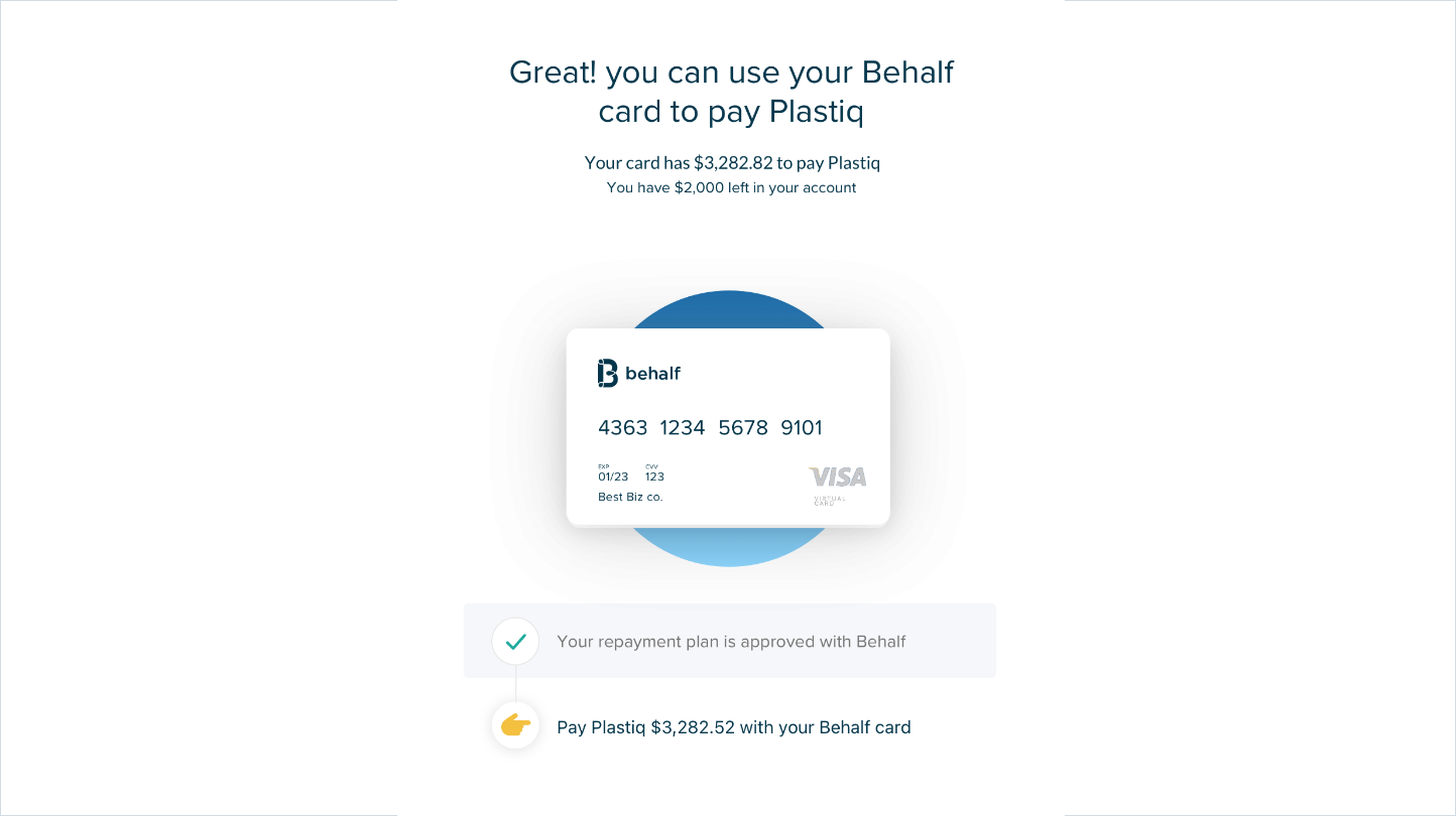
Behalf for customers
The main benefit of the redesign process is the rebuilding of the framework. design and flows will be as simple as possible for the developers to execute and maintain.
Behalf developed an unrivaled technology, but with a user experience that isn’t optimal.
A focus on the technology
As a lean startup, most of the development effort has been routed to the back-end, leaving the front-end side a bit neglected. We came to save the day.
Bringing the glory back
It is imperative for a business to have a good and solid user experience. We researched the current build, and presented a detailed solution for the board of directors.
Researching the current build
We dived into the platform to understand the structure, the pros and cons, in order to implement its logic to the new design.
The platform is a working, kicking machine that serves well a large number of loyal business users, many of whom are not tech savvy. Keeping the same build was the right path to proceed.
Simplicity & uniformity
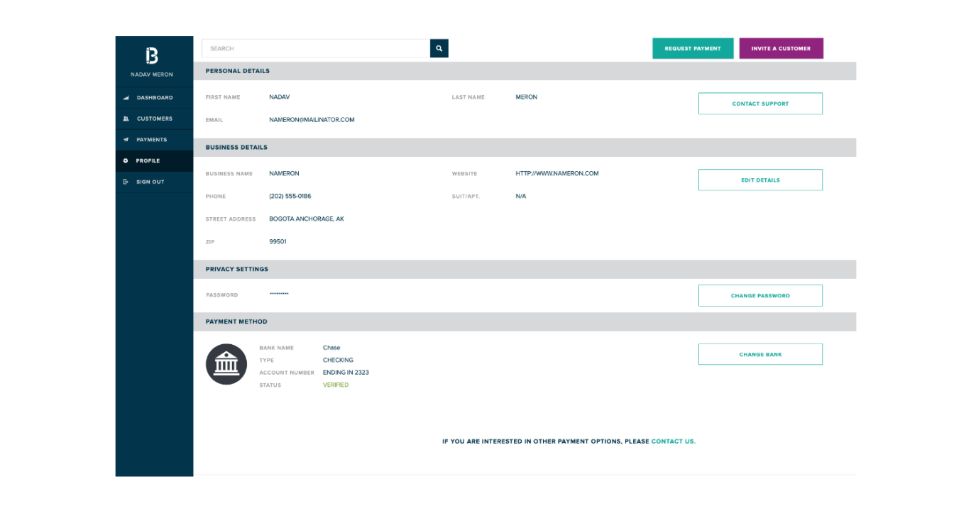
The basic principles of the platform are simplicity and uniformity. The structure is sound with clear, uniform divisions between sections, a large search module on top and all actions visible on the surface.
Stratification & hierarchy
The responsive mechanism is stretching the content so there’s a lot if empty space. Lack of hierarchy in text/captions devolves into clutter, and no stratification of content results in flows that are lengthy and divided.
Design language
The platform was designed prior to the rebranding of “Behalf”. The website and embedded app both have unique look & feel, leaving Behalf with an ununiform design language.
The way forward
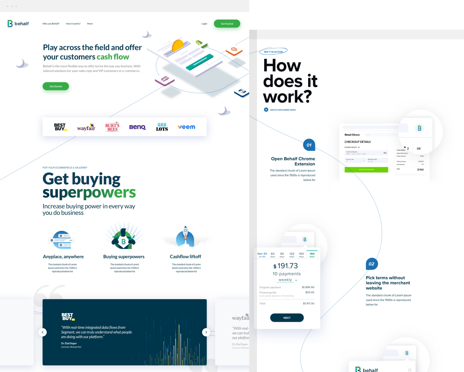
Bringing Behalf to the next level will be done by unifying the experience across all assets and turning the portal into a vehicle for the brand.
Behalf’s new visual presence will be built on several principles, all following known UX laws and patterns. The implementation of the design will rely on pre-coded modules to hasten the execution and speed up the user interaction.

Keep the existing structure of the system
More infoKeep the existing structure and logic of the system
Behalf has a loyal customers base and they need to feel at home. Moreover, the current build has a sound structure and is performing well.
The less mental energy users spend on learning an interface, the more they can dedicate towards achieving their objective.

Center the content and use pre coded modules
More infoCenter the content and use pre coded modules
Use centered positioned content as default. It minimizes issues and reduces development time in execution. Use ready made modules (as Material Design) to speed up user interaction
Productivity soars when a computer and its users interact at a pace (<400ms) that ensures that neither has to wait on the other

Stratify the content and group it together
More infoStratify the content and group it together
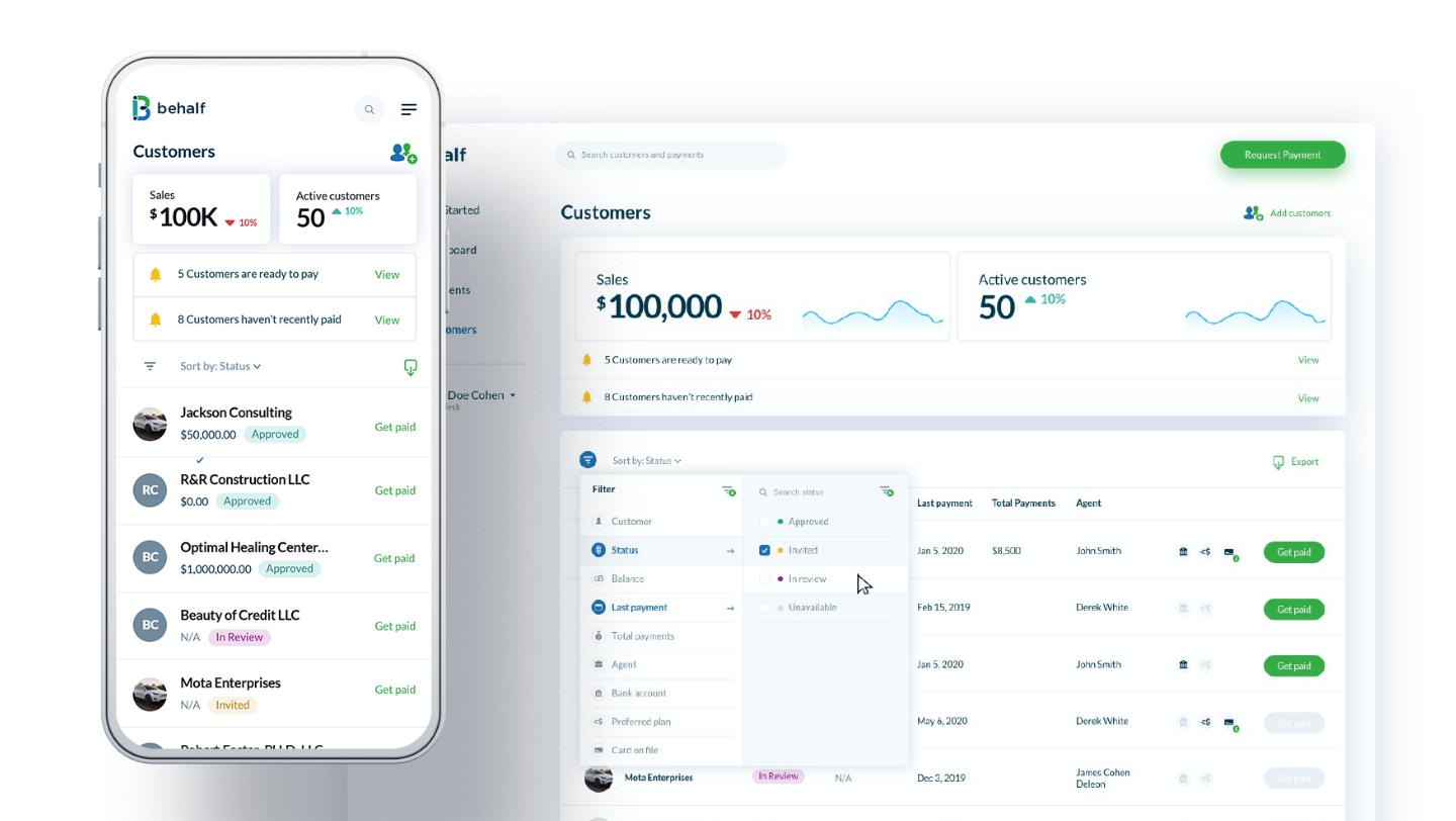
Reduce to the acceptable minimum the number of pages the user will interact with
Elements tend to be perceived into groups if they are sharing an area with a clearly defined boundary

Apply a consistent visual language across the board
More infoApply a consistent visual language across the board
The platform and the website are two sides of the same coin
Users need to face one design language throughout the interaction with a brand to make it memorable
Laying the foundations
Setting a uniform design language required going back to the basics. What does the logo convey?
Our goal was to externalize the brand values on all assets and make it pretty. “pretty” is not something trivial, as users often perceive aesthetic design as a more usable design. In order to design a uniform language, we closely examined the logo and retrieved the ideas behind it.
Color Palette.
Typography.
Lato

Use rounded
edges
The logo is based on intertwined circles, so naturally elements such as buttons and surfaces will be rounded. Infos will be grouped by a rounded frame.

Use the intersection
shape
The intersection is the core motif - three verticals (merchants, customers and Behalf) meet and integrate. The intersection shape will be a leading design element.

Use white space
between elements
The spacing between the elements sharpens the differences between the verticals. In the design, groups will be separated from each other by a visible margin.

Use colours in a
playful manner
Behalf logo conveys a stable and solid company, but with a colourful twist. The colour pallete allows for fun play in illustrations and surfaces.
Implementing to the UI
A brand new experience to be immediately understood - the new presence is a massive change, but within the ballpark.
Continuing the same logic
Behalf has a large number of loyal customers, many of whom are not tech-savvy. It is crucial the users will feel at home. The platform will keep the structure and the overall approach.
Simplifying the execution
The main benefit of the redesign process is the rebuilding of the framework. design and flows will be as simple as possible for the developers to execute and maintain.
Onboarding
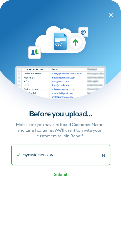
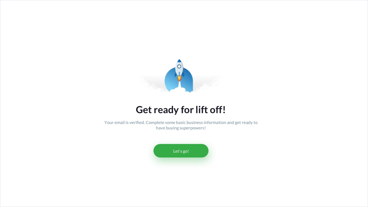
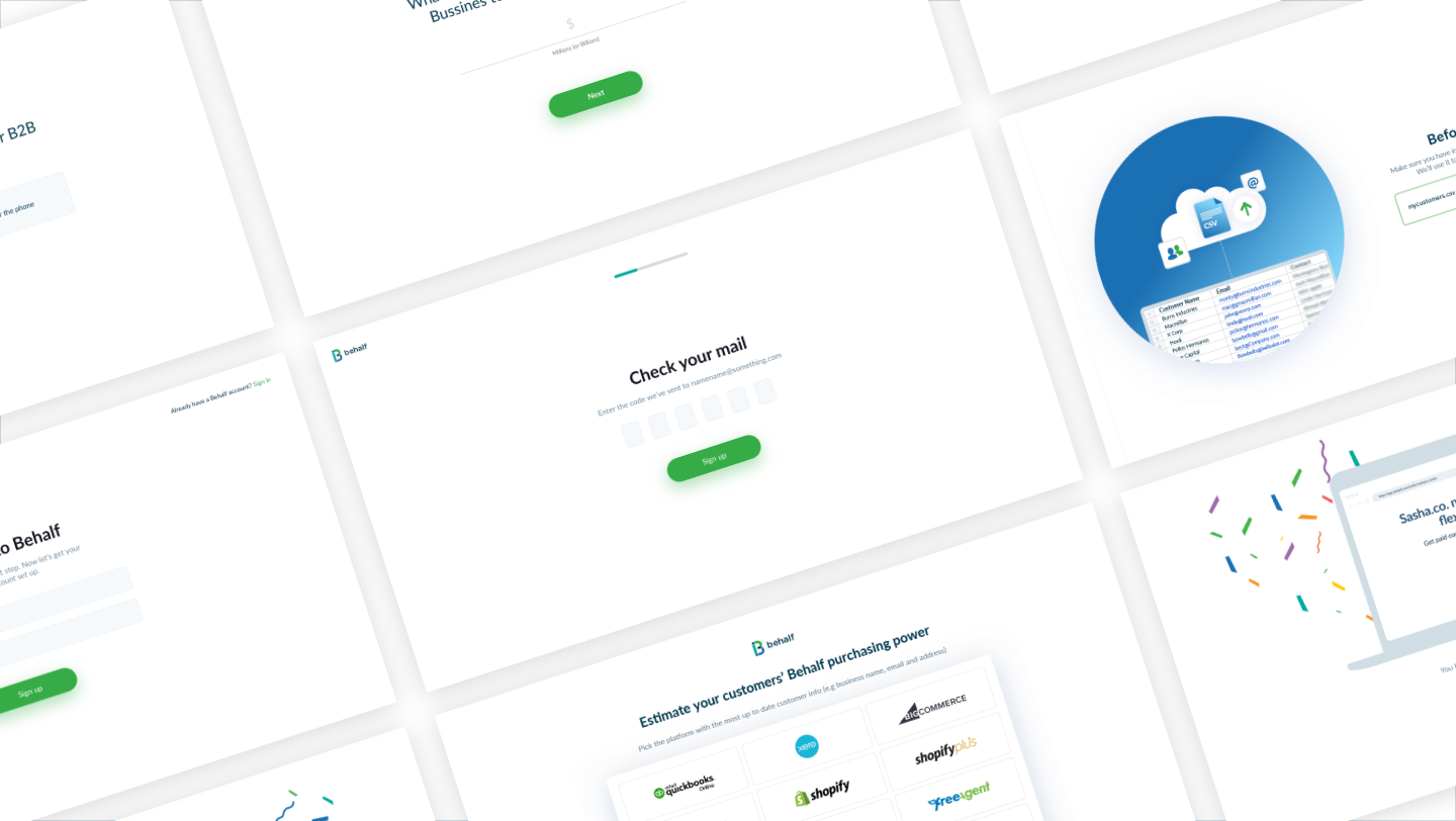
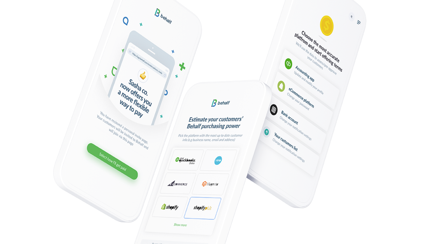
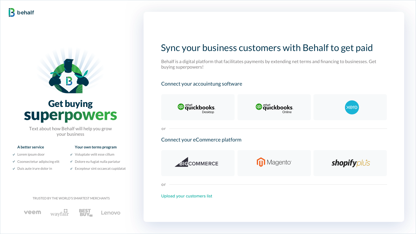
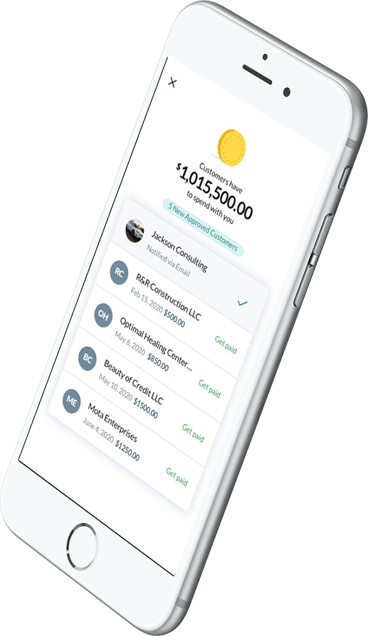
Behalf's seamless onboarding process guides users through personalized questions and prompts them to select pre-configured integrations. Additionally, they can expedite setup by uploading a CSV file containing their list of connections thus facilitating relations.
Customers table
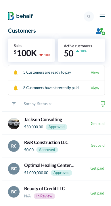
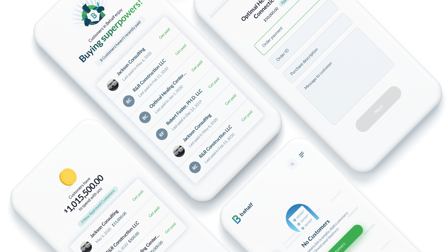
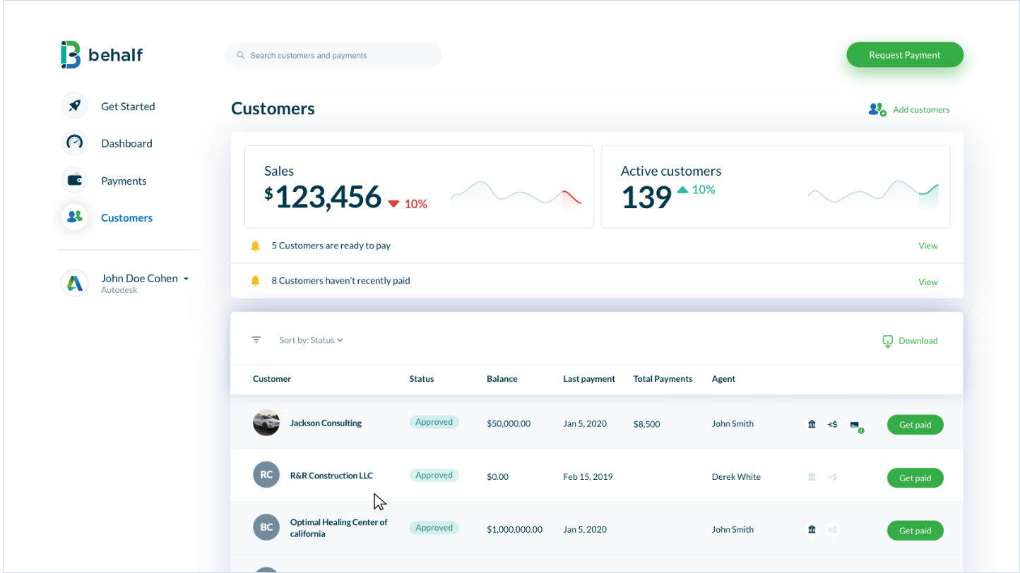
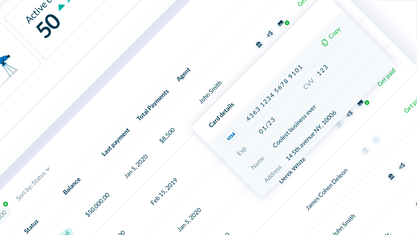
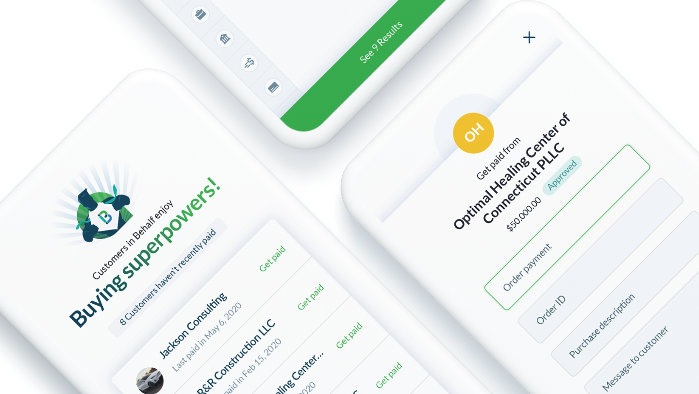
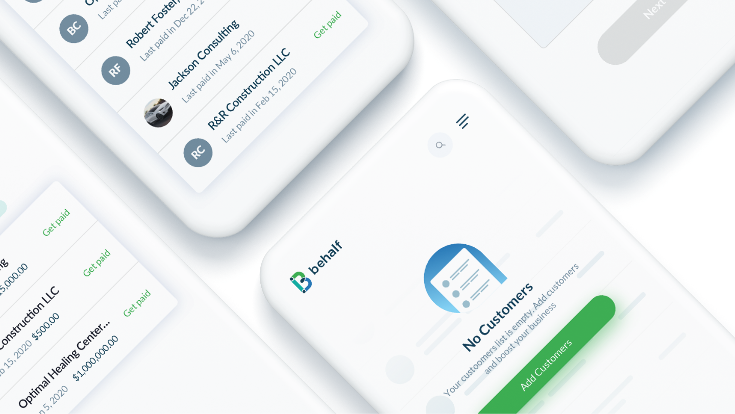
The customer list serves as the system's core, providing an aggregated overview of sales, active customers, and recent activities. Additionally, it offers a detailed breakdown of each customer's information, including payment details, credit card information, and more.
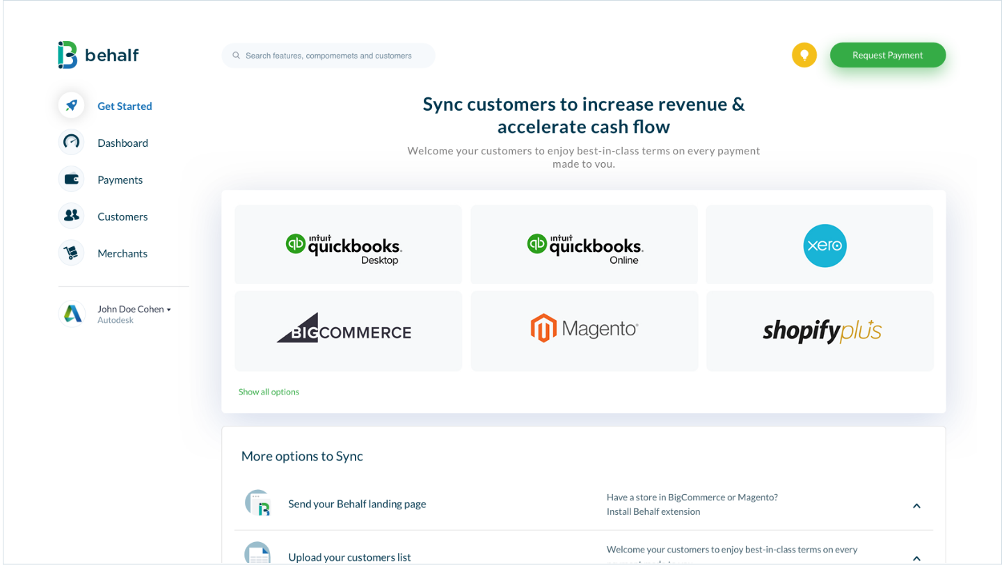
Sync customers
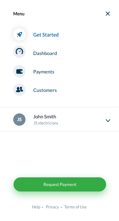
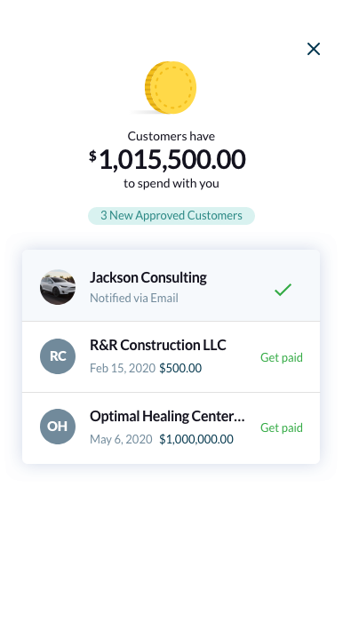
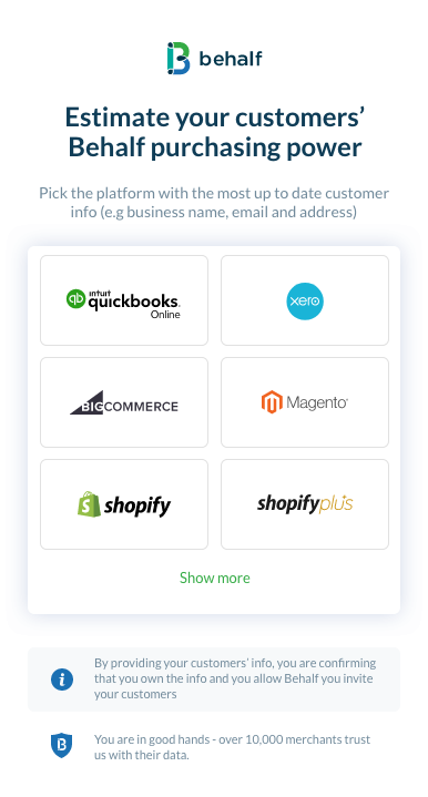
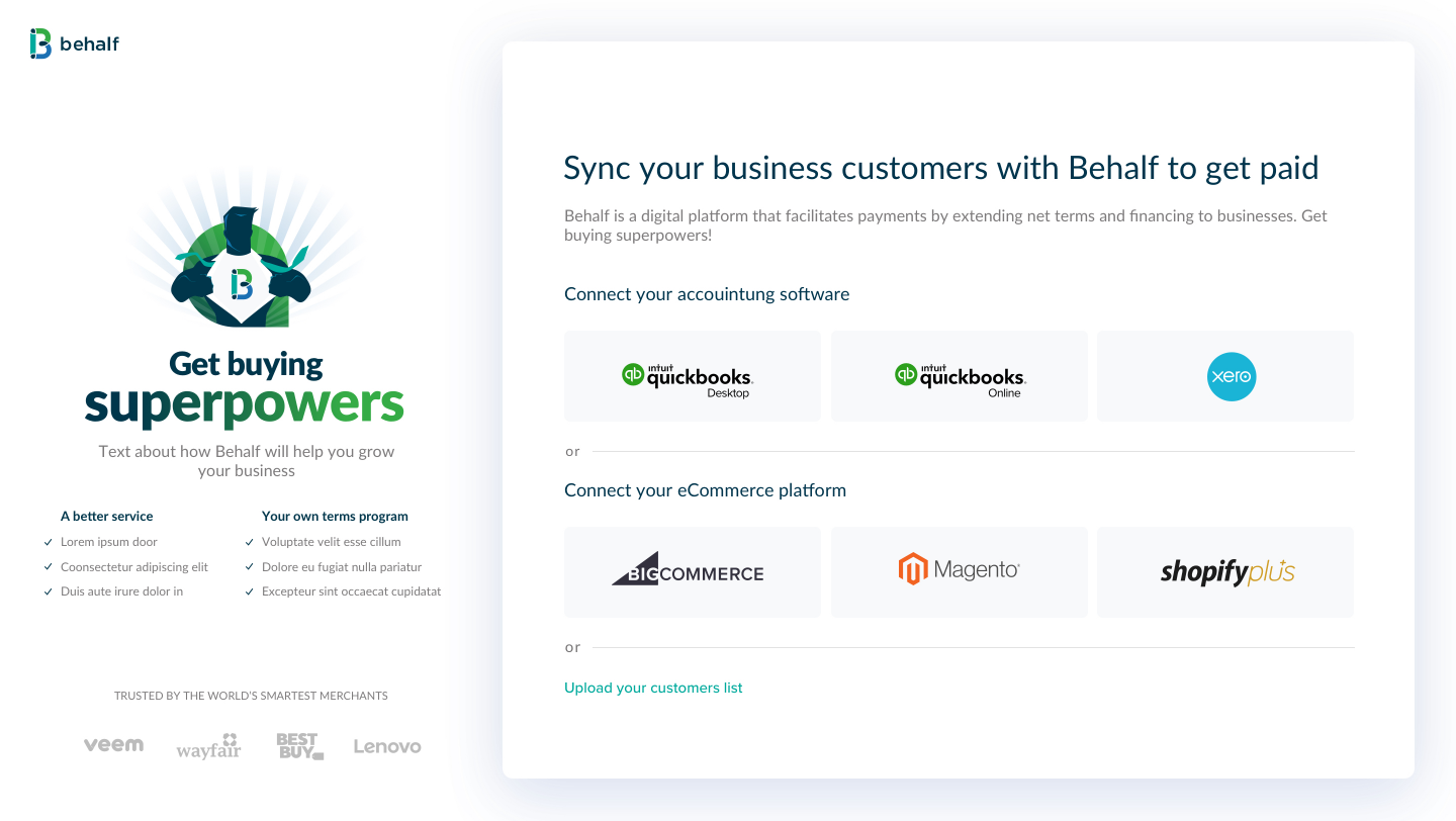
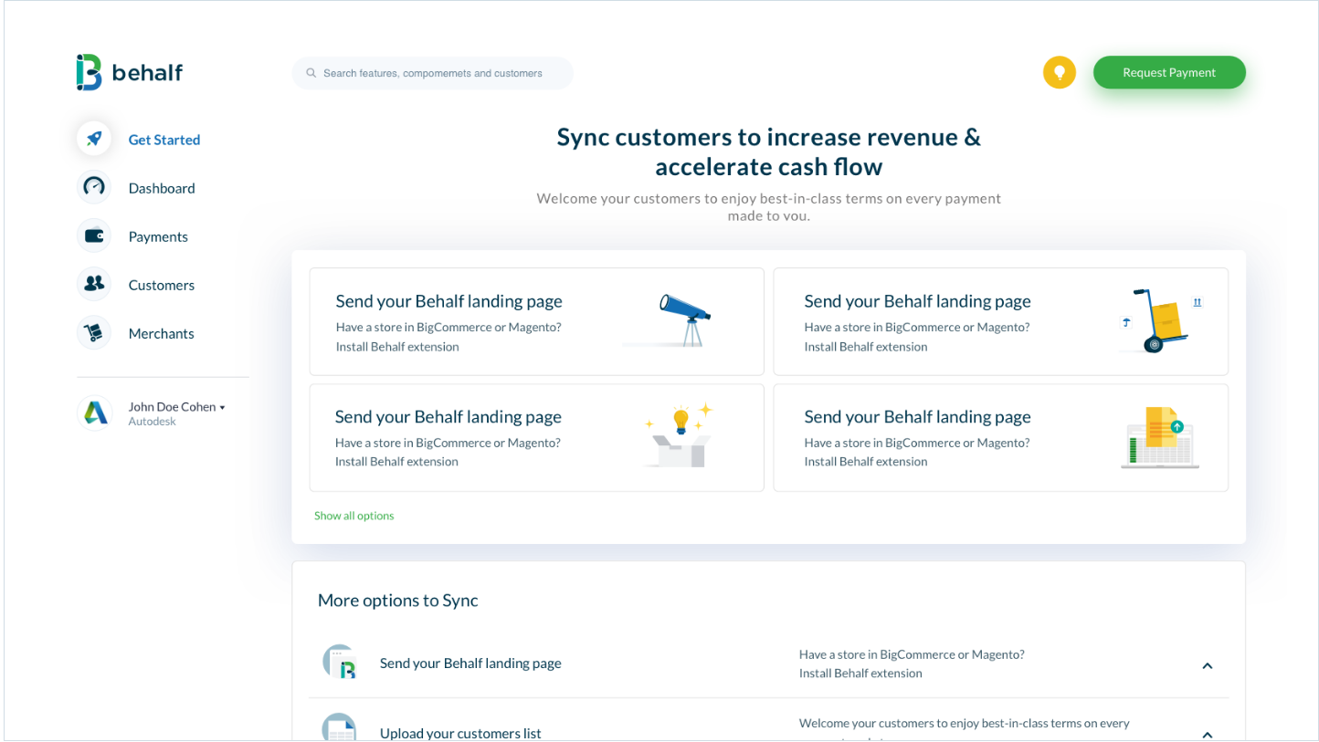
We crafted a "Get Started" page where users can select multiple channels to establish their customers' accounts, ensuring they benefit from top-tier terms with every transaction. These channels encompass pre-configured services, landing pages, invoices, and integrations.
